top of page

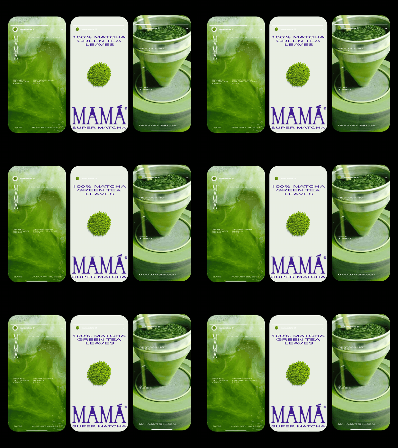
A rebranding for a family matcha business, combining its rich heritage with a modern creative strategy.
This rebranding was particularly special, as the brand was originally founded by the family of the current owners. Their passion for tea and Japanese culture inspired the creation of the original brand, and the rebranding, including a name change, serves as a tribute to their legacy while connecting at the same time with the name of this tea.
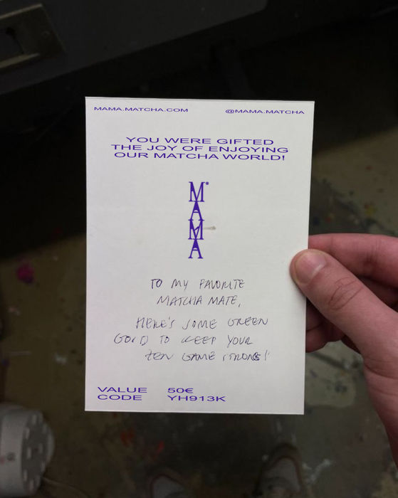
The new design, featuring green and bold electric purple, symbolizes the natural origins of matcha and the energy it provides. We drew inspiration from vintage tea logos to create a modern, yet authentic, identity. Our work included the full rebranding, packaging, and digital strategy, ensuring a seamless transition and a fresh market presence.
[2024] What we did:

bottom of page


